save your swipes!
UX/UI research and design to upgrade UC Berkeley's Cal Dining experience. Made for my Human-Centered Design DeCal Midterm & Final Project* (SP25).
View & interact here!*
Research Team: Karen Gong, Charles Ow, Jeffrey Gao (+ me!)
Timeline: 2 months (1 month research + 1 month designing)
Tools: Figma, Google Forms
Skills: UX/UI research & design, prototyping
the problem:
The way the current meal plan system works at UC Berkeley (use-it-or-lose-it weekly "swipes" and multipurpose "flex dollars"), there is nothing you can do with unused swipes at the end of the week. Many students do not use up all of their swipes by the end of the week, getting refreshed away and leaving students unable to fully maximize the value of the meal plan they pay for.
This project tackles the question: "how might we reimagine the campus dining experience to maximize meal plan flexibility for college students?"
*Click here to skip to my hi-fi design
user research
From surveying 49 Cal students via Google Forms and conducting 4 user interviews of students from different grade levels and holding different meal plans, my team and I came to the following key insights about the current Cal Dining experience:
FLEXIBILITY: students' favorite aspect was the flexibility of flex dollars
LIMITED USAGE: limited food options and inflexible meal times cause frustration and leave swipes unused; 71% of students surveyed had at least 1 swipe left over per week
QUALITY: food quality varied, with the most appetizing options being at "The Eateries", which are conveniently located on-campus, but are not open later into the night like the dining halls
EXCLUSIVITY: biggest critique was not being able to share swipes with others, as bringing a friend into a dining hall required you to use flex dollars instead of swipes

user personas included the Residential Assistant (RA) who has a meal plan with unlimited swipes, the freshman living in the dorms on the standard Blue plan which includes 12 swipes per week, and the off-campus upperclassmen who buys a meal plan with just 5 swipes per week

freshie journey map

infinite swiper (RA) journey map
ideation
Using divergent methods, I explored ways to add to the current dining experience by improving food options and quality were before focusing on different ways to change the meal plan structure in mind mapping. When ideating with convergent methods, I focused on changing the structure of swipes by allowing for swipe transfer to fellow Cal students or donation banks and exploring ways to implement that through a meal plan management system.
lo-fi prototyping
I moved forward with swipe donation bank and sending to a friend because they are low effort and mid-high reward once the meal plan structure is edited to allow for swipe transfer.
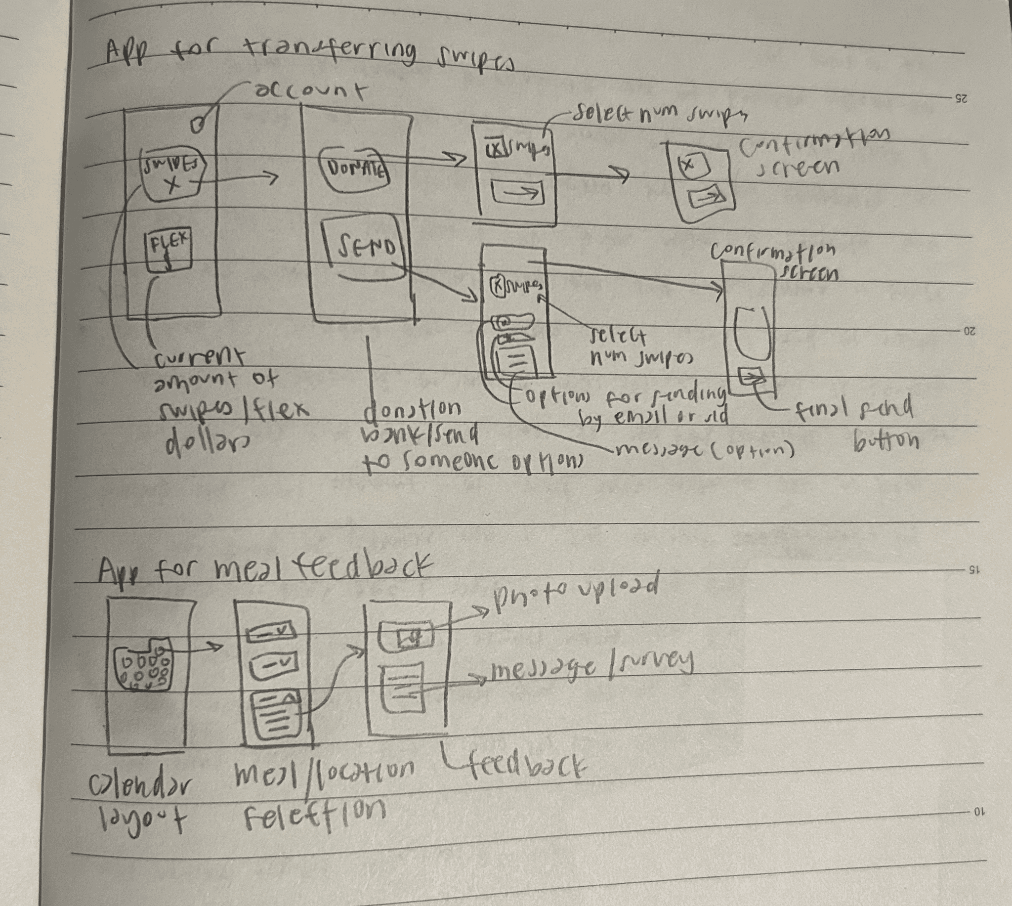
lo-fi wireframes of app interfaces for transferring swipes and for meal feedback
mid-fi prototyping
I moved forward with app for transferring swipes since it seemed the most practical if it actually existed. From my original lo-fi prototype, I combined the donate/send screens with the confirmation screen with the confirm CTA button to reduce redundancy while still communicating that the action is final with a popup instead.
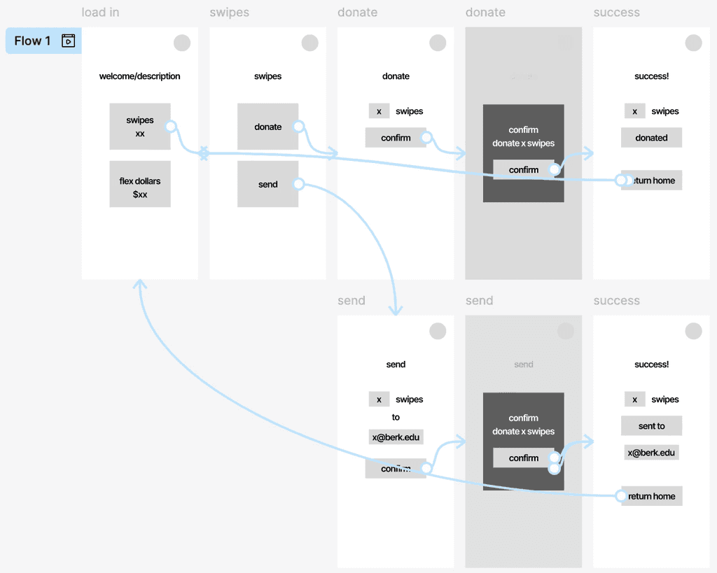
mid-fi wireframing of a swipe transferring app interface; click here* to interact!
usability testing
Insights from usability testing included:
liking the idea of being able to transfer swipes either to a friend or those in need
difficulty navigating back to the original page
appreciated the confirmation pages because "sometimes I do be clicking stuff”
hi-fi design
In the high-fi design, I made sure to add in "home" and "x-out" buttons since they were missing from the mid-fi designs for the user to navigate out. I made the options more clear on the home page for what actions you could do with each category since it caused some ambiguity on what to expect when clicking on each category in the usability test. I kept the confirmation popup page because even though I thought it might be redundant, my user appreciated the confirmation screen.
View and interact below & here*!
______
This project and DeCal class equipped me with strong HCD foundations and allowed me and my teammates to tackle a problem we all faced during our time at Cal. If the meal swipe system was actually edited to allow for swipe transfer, I feel that my design could be implemented as a simple, accessible way to facilitate meal plan management that the current website does not offer.
gob ears :')